Icelandic Glacial Water
Infusing the world’s most abundant natural resource with tantalizing mystique, we developed the identity and package design for Icelandic water that’s been filtered for 5,000 years through layers of lava rock.
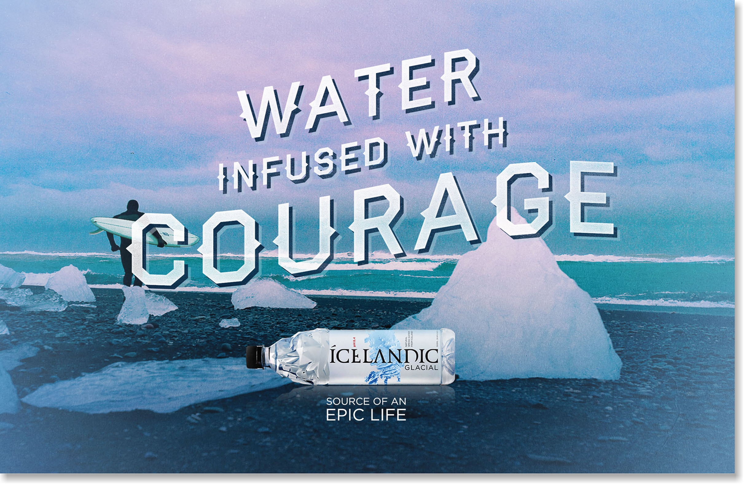
For most, water is a commodity. To distinguish itself, it must stand for a much larger idea in the consumer’s mind. Identity and package design works to their fullest potential only when they're informed by a larger narrative that resonates with consumers. Our approach was to create an idea that transcends the packaging—where the design is the beginning of a larger story.


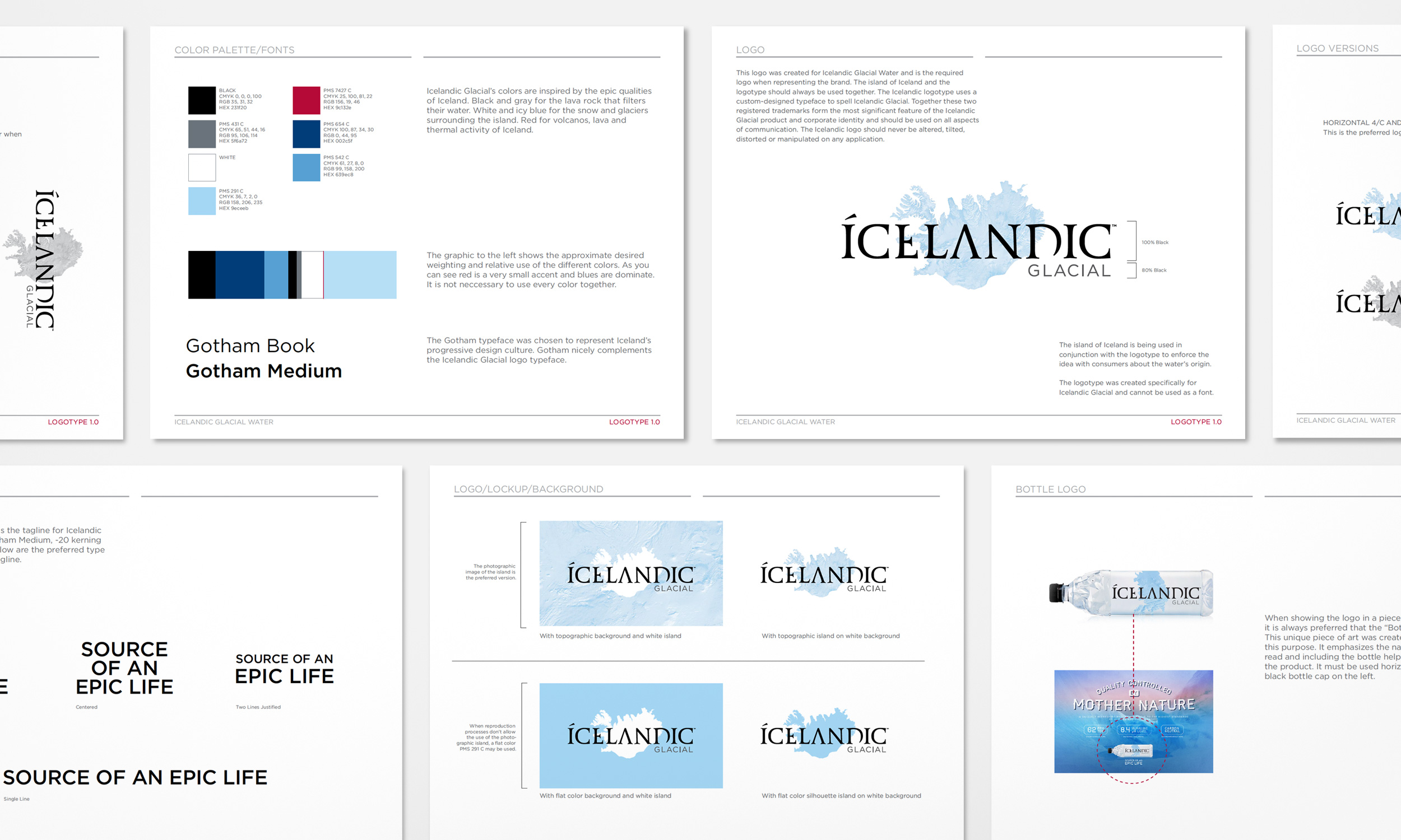
Ice represents the source of pure water and symbolizes the purity of all Icelandic products. Accordingly, it inspired the unique shape of the bottle as well as the unconventional typography of its label. We wanted the type to have a certain classicism, hence the rather traditional serif font we used as a starting point.
We looked at typography that was “reductive” or stripped down, literally missing pieces of several of the typeface's characters, in order to reflect the stark power of the Icelandic landscape and almost resemble shards of ice. Part of our brand strategy was to lean into the country of Iceland as a brand, so we wanted the type to look exotic. Icelandic words have a distinct look, rendered in type that have unique ligatures and accent marks. We gave the logotype certain eccentricities that give it a hint of Iceland's written language.